Key points
- Broncos unveil first rebrand in 25 years to modernise brand and target global growth.
- New design boosts Brisbane identity but drops key elements that drive fan recognition.
- Shift from traditional logo risks disconnect with long-time supporters.
- Success depends on clear marketing to support global ambitions.
By Dr Rajat Roy
With NRL and AFL premierships in the bag and the Olympics on the horizon, it’s an exciting time to be a sports fan in Brisbane.
The Brisbane Broncos are clearly looking to capitalise on this momentum with their first rebrand in 25 years.
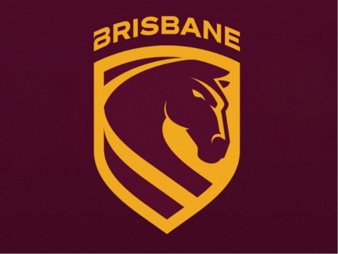
The NRL club’s new logo, home and away strips, and “We Charge On” battlecry mark a deliberate push to modernise the team’s image while positioning the Broncos for domestic dominance - and, ambitiously - global recognition.
A bold new era for the Broncos
From a design perspective, the forward-facing Bronco and shield motif are striking.
The flowing stripe nodding to the Brisbane River and the homage to Cyril Connell in the away jersey convey thoughtful symbolism and a connection to local heritage.
There is no denying the aesthetic polish and the potential for stronger civic identification.
Where the rebrand risks losing fans
Yet the new look also presents some challenges from a branding and marketing standpoint.
Removing the “Broncos” wordmark strips away a core verbal identity that has built strong recall over decades.
Sports brands with high recognition - think Cowboys, Raiders, Roosters - rely on a blend of verbal and visual cues to cement fan loyalty.
While the new forward-facing Bronco aligns with the “We Charge On” narrative, it departs from the familiar silhouette fans have emotionally embraced for generations. Abrupt shifts risk appearing disruptive rather than evolutionary.
There is also a subtle tension in the symbolic elements. The stripe representing the Brisbane River and the forward motion indicating momentum are conceptually appealing, but their meaning is too understated.

If you need to explain it, it there really any point to it?
Local strength vs global ambition
The ambition to position the Broncos as a globally recognised sports brand is admirable, especially with Brisbane gearing up for the 2032 Olympics.
Star fullback Reece Walsh is already being touted as rugby league’s first true international superstar, with the potential to carry the Broncos’ brand abroad.
However, the refreshed mark still reads as local and traditional rather than globally contemporary.
If international growth is the objective, the visual language may need to be bolder and more distinctive.
The challenge of telling a clearer brand story
Meanwhile, messaging like “Our logo has changed but our brand doesn’t” is conceptually contradictory. A logo is arguably the most visible expression of a brand; to minimise its significance undermines the very rationale for this redesign.
Overall, the 2026 rebrand is a confident, contemporary step forward.
It strengthens civic identity and offers a polished, forward-looking look for the Broncos’ next chapter.
But to achieve its full potential - both in fan engagement and global positioning - the club will need a focused promotional strategy to embed the symbolism and clarify the brand story.
Only then can Brisbane truly charge on, not just in the NRL, but in the wider world of sport.
* Dr Rajat Roy is an Associate Professor of Marketing at the Bond Business School, Bond University.